Identity Development
Project Brief
The idea was to make a logo or brand as simple as possible. The logo is for a personal project. A proof of concept for a longboard manufacturing venture I was planning to do with a friend.
A longboard is a skateboard (despite what skateboard purists argue), with decks usually longer than 28in or 72cm. They come in various shapes and sizes, some go beyond 60in or 152cm. And are used in various disciplines from commuting, freestyling, freeriding and downhill racing.
Goal
The short term goal was to convince a prospective business partner who also happens to be my friend to join me in this journey. I wanted a logo that would connect him + me = longboard venture. The long term goal was of course to be a household name.
Initial Thoughts
I made a short list of how I want this “soon to be business” represented.
- It has to be something we both would relate to.
- It should represent us and the business.
- And when people see it, those who knows our background would get it in a “Yeah, that makes sense” kind of way.
- A coolness factor wouldn’t hurt.
Exploring Ideas
Starting with the most obvious means playing around with our names (Rod + Danny). At this point it looks like a union, well in a way because it is. My ideas and skills with his expertise and experience.

Also at the beginning of a logo project I always gravitate to “Wordmark” as my go to logo type of choice. It’s easier somehow and helps (me) get the creative juices flowing. I find it helpful to work with pen and paper when bouncing ideas around. Occasionally jotting down notes as well. Just putting down anything that goes through your mind. Making my thoughts tangible helps me with direction.
Some notable words that jumped out for me during this exercise were –
- All aboard
- Bamboo longboards = boords or booards

After some time I would have worked out a story in my head. Abstract images would have been floating around wrapped in thought bubbles with pictures, emblems and shapes.
Whenever I get stuck with an idea and I can’t move around it like the wordmarks, I open photoshop and see where it takes me.

Fonts used
I was particularly looking for rounded letters especially the letter “O”. I liked how Courier New Regular looked, it speaks craftsman or builder, it has the rustic feel I was looking for. I decided to use a symbol Δ instead of the letter “A” to break the flow. But it didn’t sit well.
I saw this N.O. – Movement while browsing for fonts, it has the rounded “O” as well. But it looks too modern for my needs.
The last one I made using basic shapes. It also ended up looking too modern. I decided to move on and try something else.
Back to my notes and sketches it’s time to try a “Lettermark” logo. I made a few attempts but eventually chucked it as a dead end. I didn’t have a feel for it.

A little backstory
I’ve known Danny for a long time, even then he was already working as a builder/carpenter. Which made him an ideal choice to be a partner in this “longboard business venture” I can’t stop thinking about.
Back in the day we both ended up working on cruise ships. He still works there, but I left to pursue other interests. That trip down memory lane made me think of nautical related icons.
Since longboards were direct descendants of surfboards anyway I played around with a few nautical symbols but somehow the anchor seems to be speaking to me the loudest.

Funny thing is, playing around with anchors made me think about its main purpose which is to keep ships in place to avoid drifting. It’s easy to interpret it as a negative like something that holds things back. Especially for a startup.
And why would longboards need anchors anyway.
I gave it a lot of thought but eventually I had to wrestle the idea out of my system before I could shut it down completely. And went back to my notes.
Feeling deflated that I couldn’t save my anchor idea I went back to what I have so far. Waiting for a new concept to jump out when I noticed something…

Flipping the anchor reminded me of a “trident”. Poseidon/Neptune wielded one, King Triton, Aquaman and Namor all had one. A symbol of power! Ding, ding, ding – we have a winner.
With this new direction, I had a few things I want to incorporate in the new design.
- I want this to be a “Combination Mark”, Lettermark (abooard) + Symbol
- I want to make the symbol tie in with the delta’s of the lettermark
- Somehow add the initials R & D somewhere
Bringing it all together
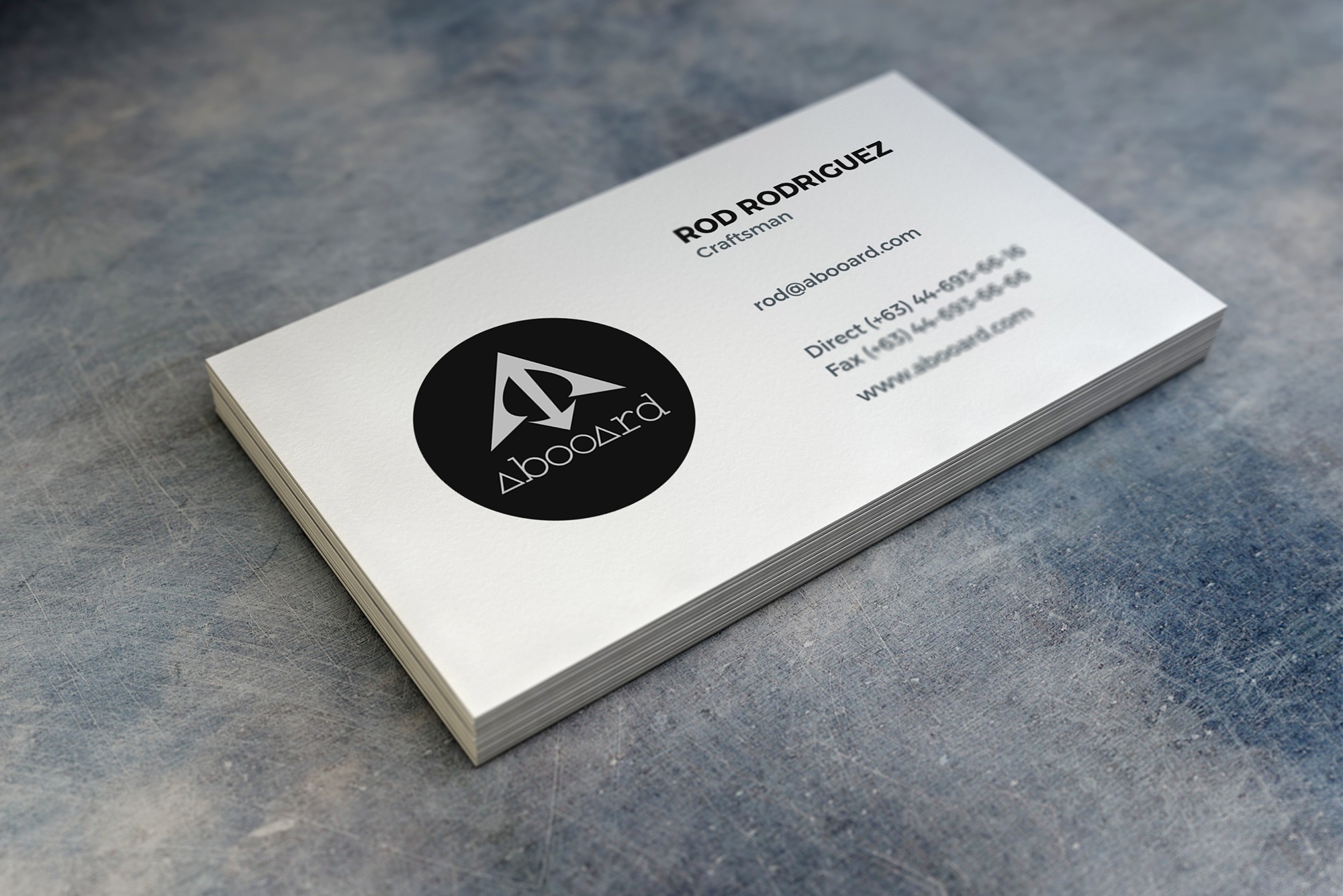
From my early sketches the lettermark abooard was a contender. It only makes sense that the symbol should blend with it. As you can see I chose to invert the trident and just keep the prongs with no handle. So it still has the anchor features. And I think this compliments the delta’s in the lettermark.
The initials were an over reach and self indulgent I think, but if you look closely you could make out on the left hand side is a left facing “R” and a broken “D” on the right hand side. They are interchangeable actually.


abooard – on a sign 
on tees 
abooard cutout longboard
Take away
If you’re still here then I should tell you that the venture died before it even began. I overestimated my friends entrepreneurial spirit. In the end he chose to stick to his day job. I didn’t even reach a point to present my revolutionary idea. But the important thing is I had fun doing this test case. It’s always good to flex the creative muscles. Practice makes better.
Just a quick run through of some key points of my process.
- Start with what you know
- Put your ideas on paper
- When in doubt go with what you are familiar with
- If you get lost review your notes
- Build fast, fail fast, repeat
- Have lots of fun
Although there was no real client as this was a personal project, my core process would be the same.