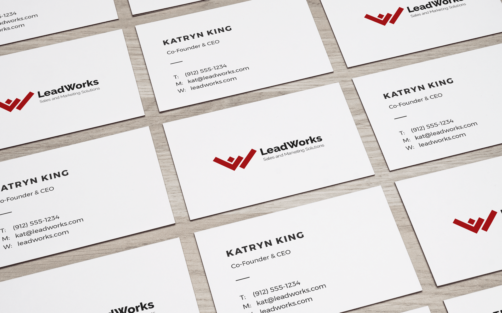
Identity Development
Client Description and Services
The business is an upcoming startup founded by 2 friends. They will provide sales and marketing solutions for transportation, warehouse and logistics companies.
The Initial Plan
During the first meeting I was given the company’s goals and background that gave me some ideas but nothing stood out.
So I put together an in depth questionnaire for the client, hoping their answers would help me get a better understanding what direction the logo development should take.
Exploring Ideas (how it went down)
While waiting for the client to get back to me I started doing some research to get some inspiration before starting on the actual project.
I played around in my notebook writing and drawing anything that comes to mind. I make a habit of putting everything on paper from words, group of words or symbols. I find this helpful when trying to form ideas and concepts.
The company name is always a good starting point when breaking down components to jump start the flow of creative juices.
So the first thing that stood out for me in this project were the initials L+W for LeadWorks.

The next idea came from the tagline which is “Sales and Marketing Solutions”.
*Sales and Marketing made me think of line graphs and bar graphs.

While the word *Solution made me think of items that need to get done and ofcourse checkmarks (✔).
I immediately saw the shape similarity of the letter L and checkmark (✔), then mirroring the checkmark looked like a W. I thought that was pretty interesting and kept going in that direction.


I played around with this concept and I saw something that I liked. It felt like a jigsaw puzzle falling into place.

The clients feedback
I know I should have waited for the answers to the questionnaire I sent but I felt really strong about the design that I decided to send it through, and my hunch paid off, I was very lucky that both founders liked it and their only feedback was to add color to the logo.
They chose red. I picked a shade that’s young and vibrant something that speaks up and coming but when I sent them this version.

They came back with –
Scarlet is a brilliant red color with a tinge of orange. … In the Roman Catholic Church, scarlet is the color worn by a cardinal, and is associated with the blood of Christ and the Christian martyrs
I can’t really argue with that.
In the end having a mature color hue gave the logo an experienced and professional feel.
CMYK: (27, 99, 99, 28) || RGB: (144, 27, 29) || HEX: #901b1d
Final Version

Fonts used
Two weights from the Raleway family font was used for the wordmark. *Raleway Extra Bold for the lead and *Raleway Light for the tag line.
Final Thoughts
I really felt lucky that everything lined up with this project. But I can also thank my experience and the process I came up with after years of trial and error.
Take away
I would never suggest sending a design proposal without having all the information from the client. But also don’t be afraid to trust your instincts. Even if they shut you down you can only learn more from the experience and get your ideas closer to what would make the client happy.
